Audiovisual trip
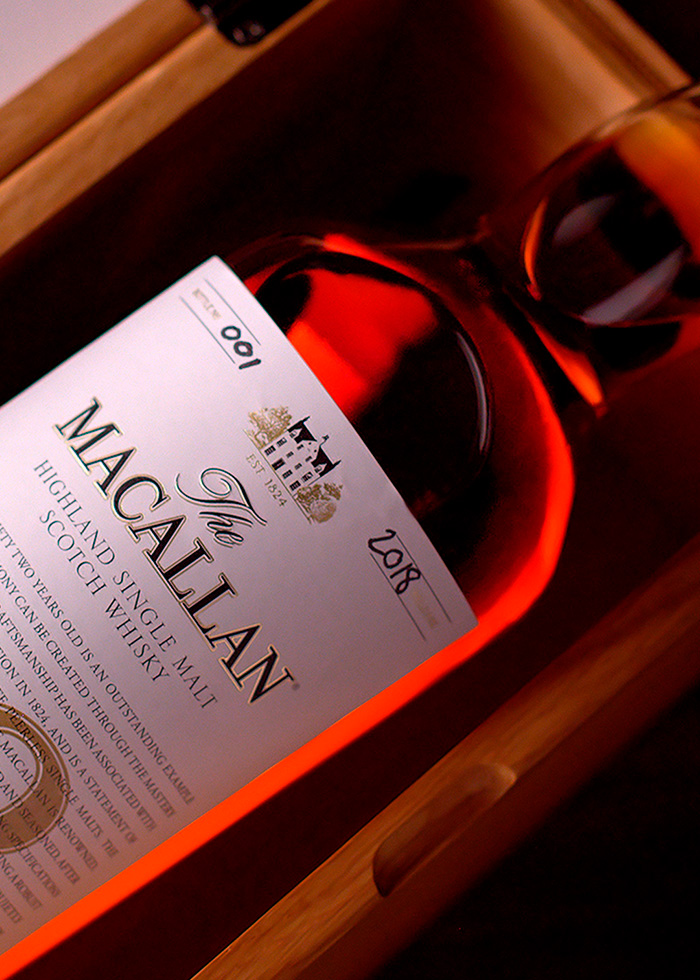
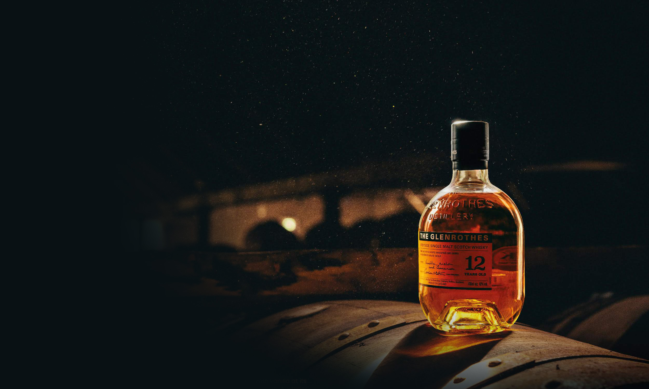
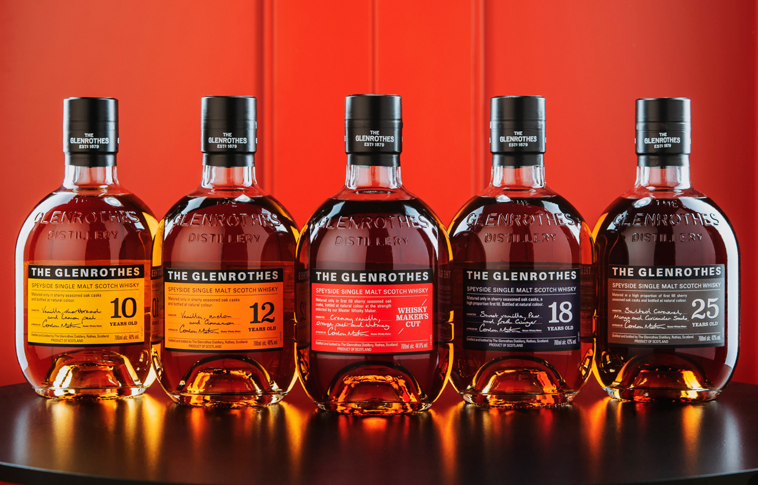
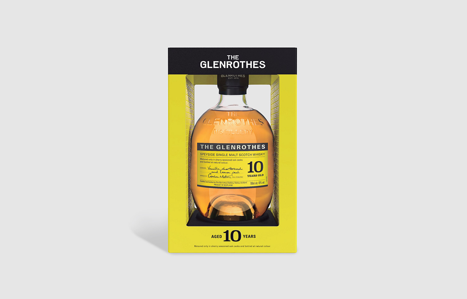
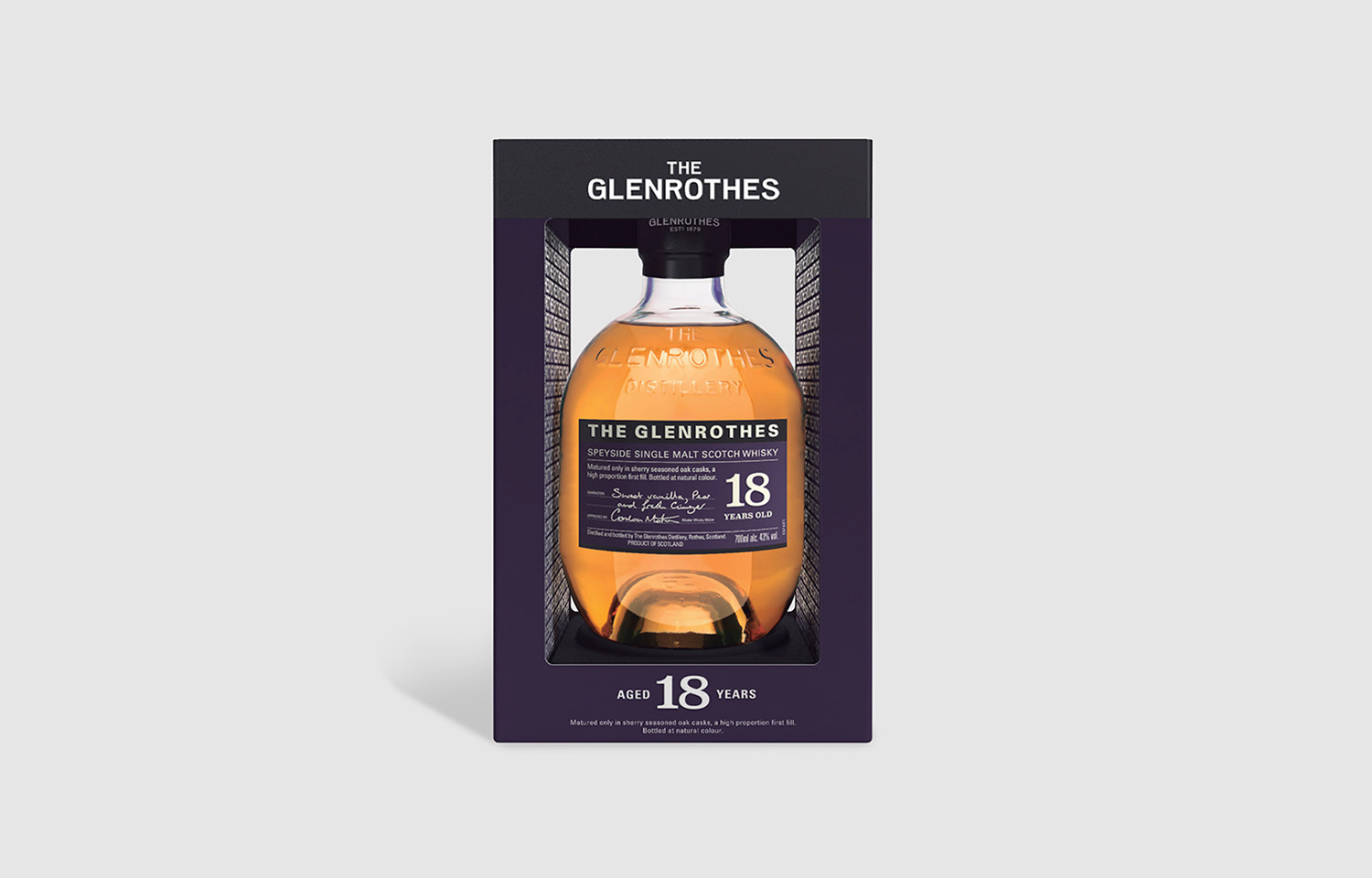
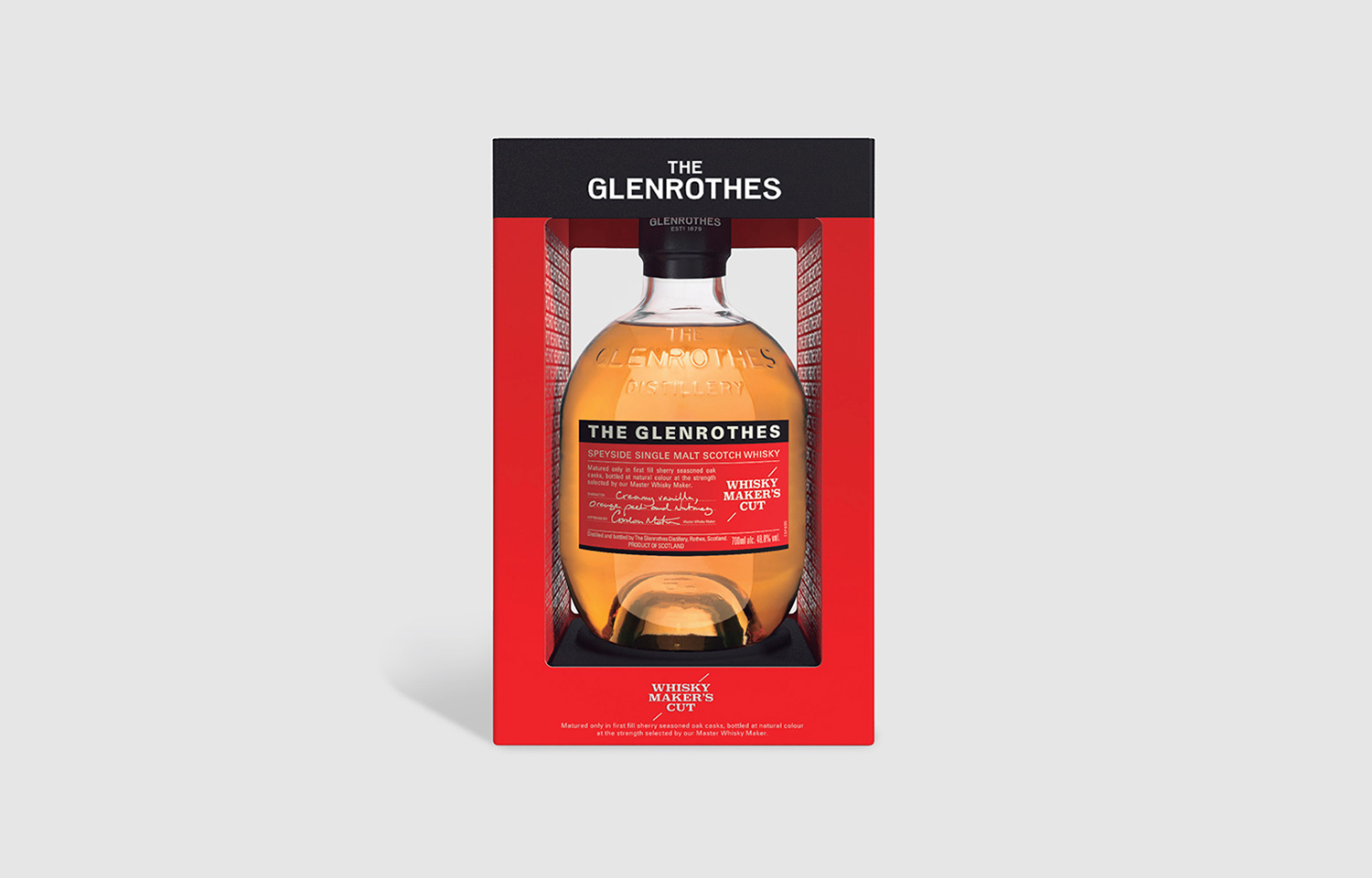
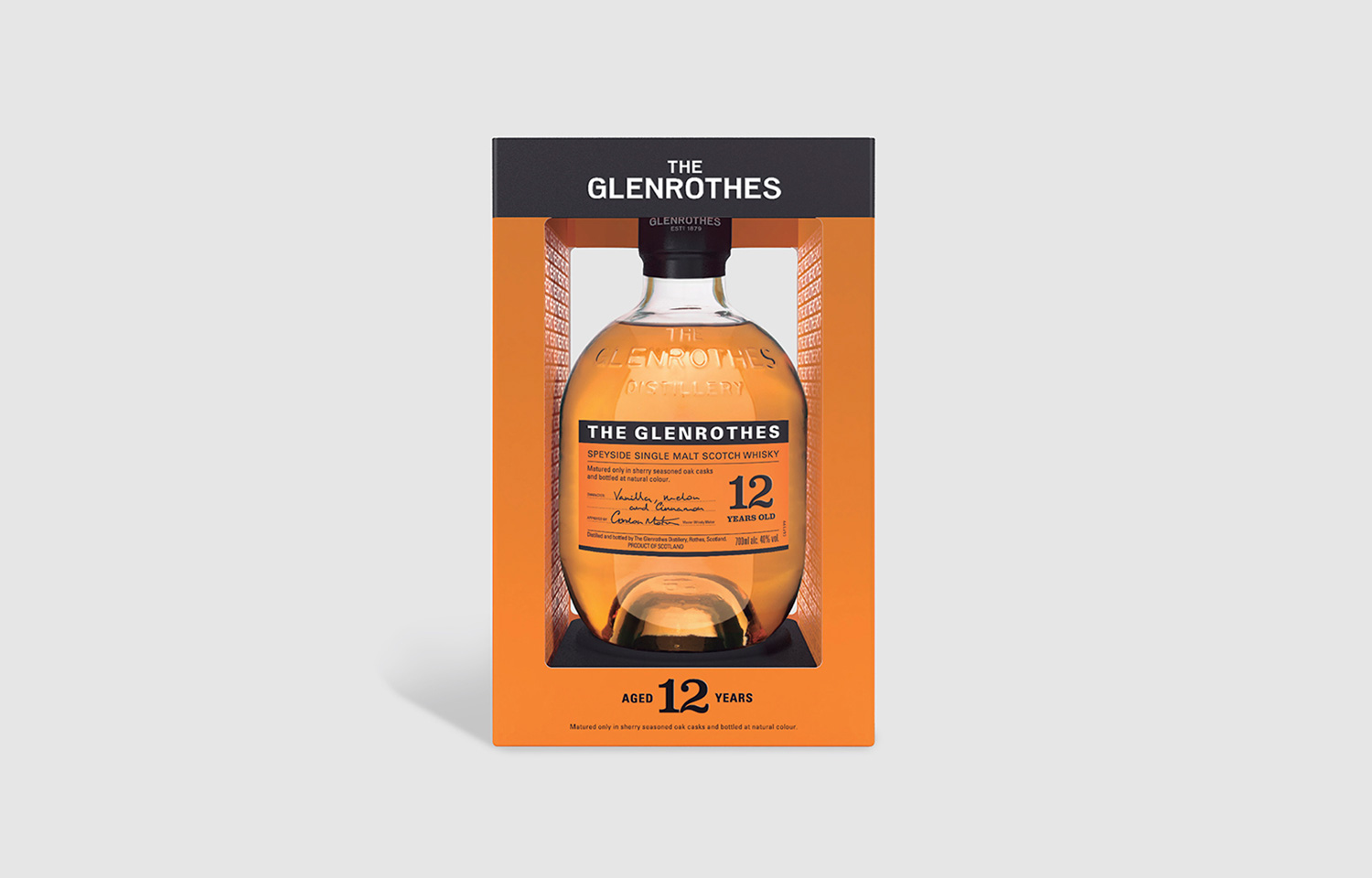
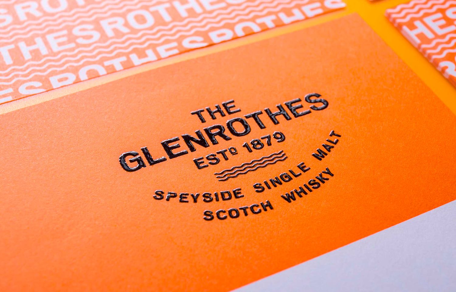
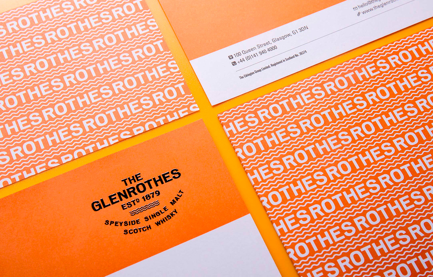
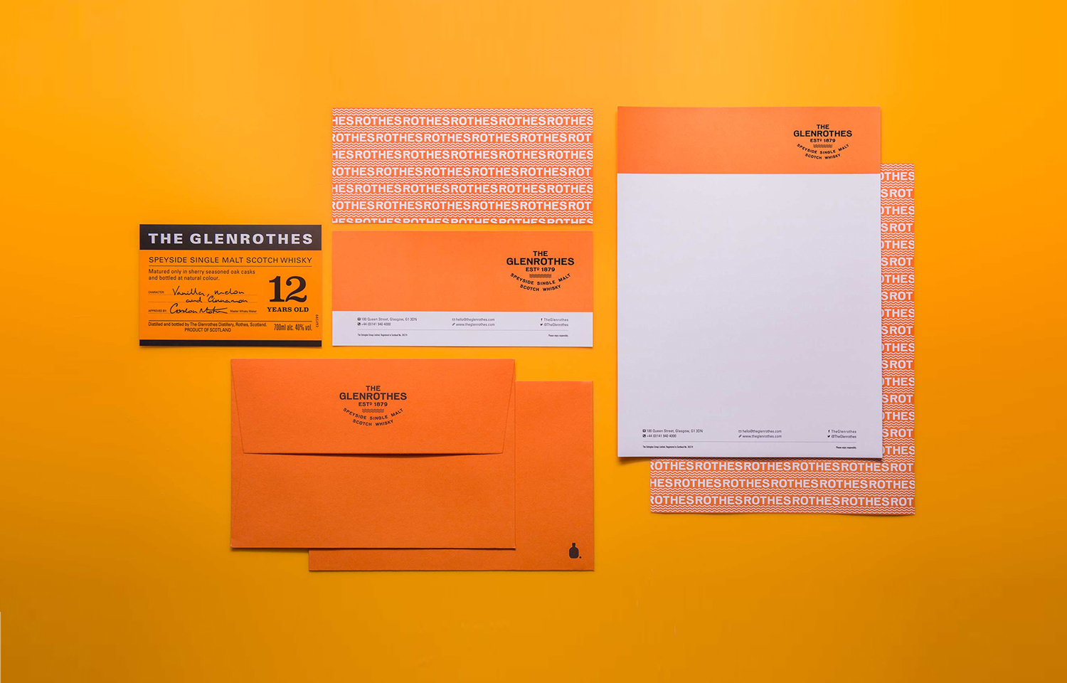
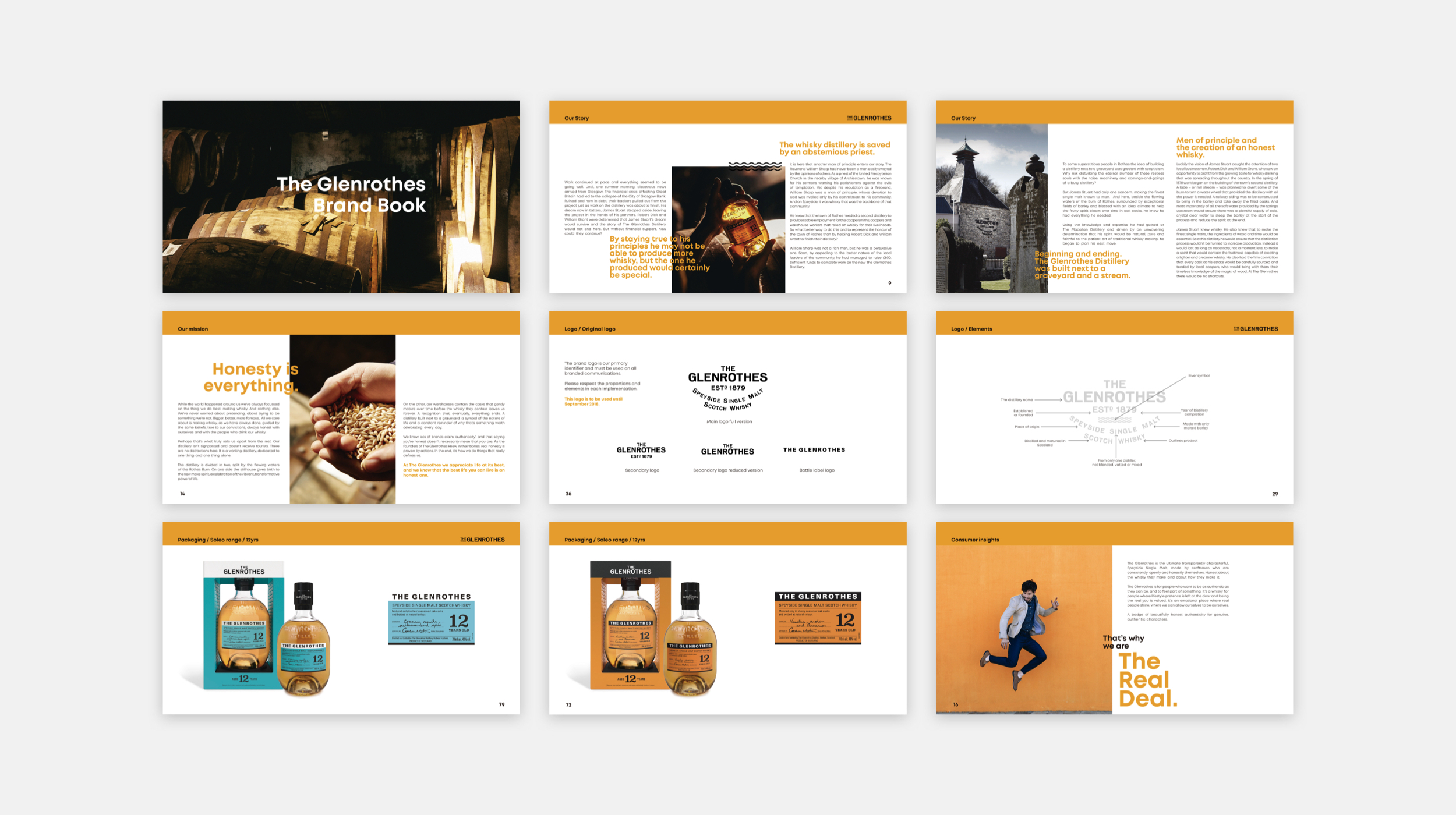
This extreme makeover was a total update of the look&feel of the brand. The iconic bottle shape and the window frame-like structure that preserves and presents the bottle remain the same, while the range now stands out within the usual palette we expect to find in whisky packaging and signage.
Client
The Glenrothes
Project
Glenrothes Rebranding
Category
Branding, Packaging, Web Design
Year
2020
Photography
Yosigo