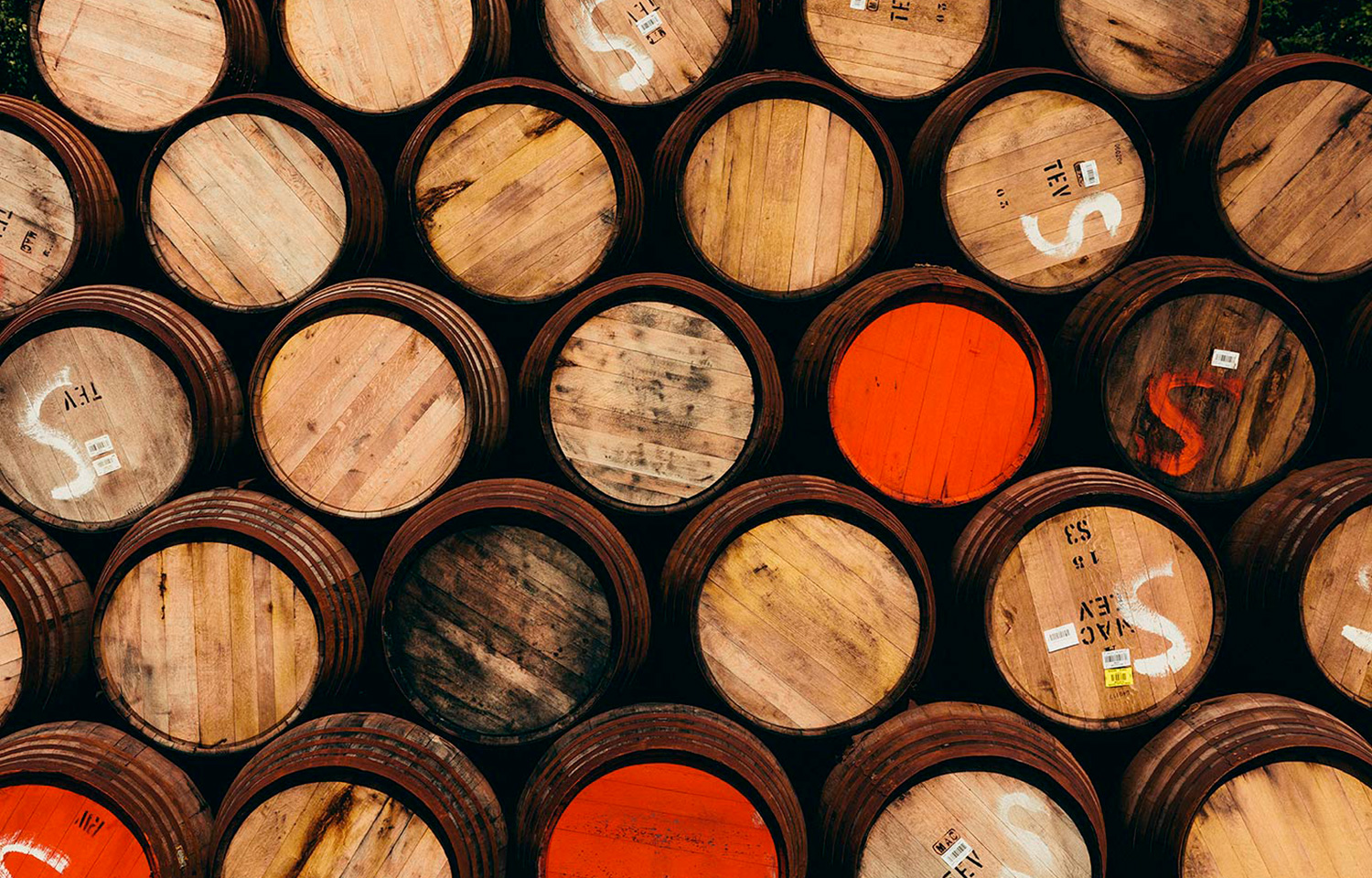
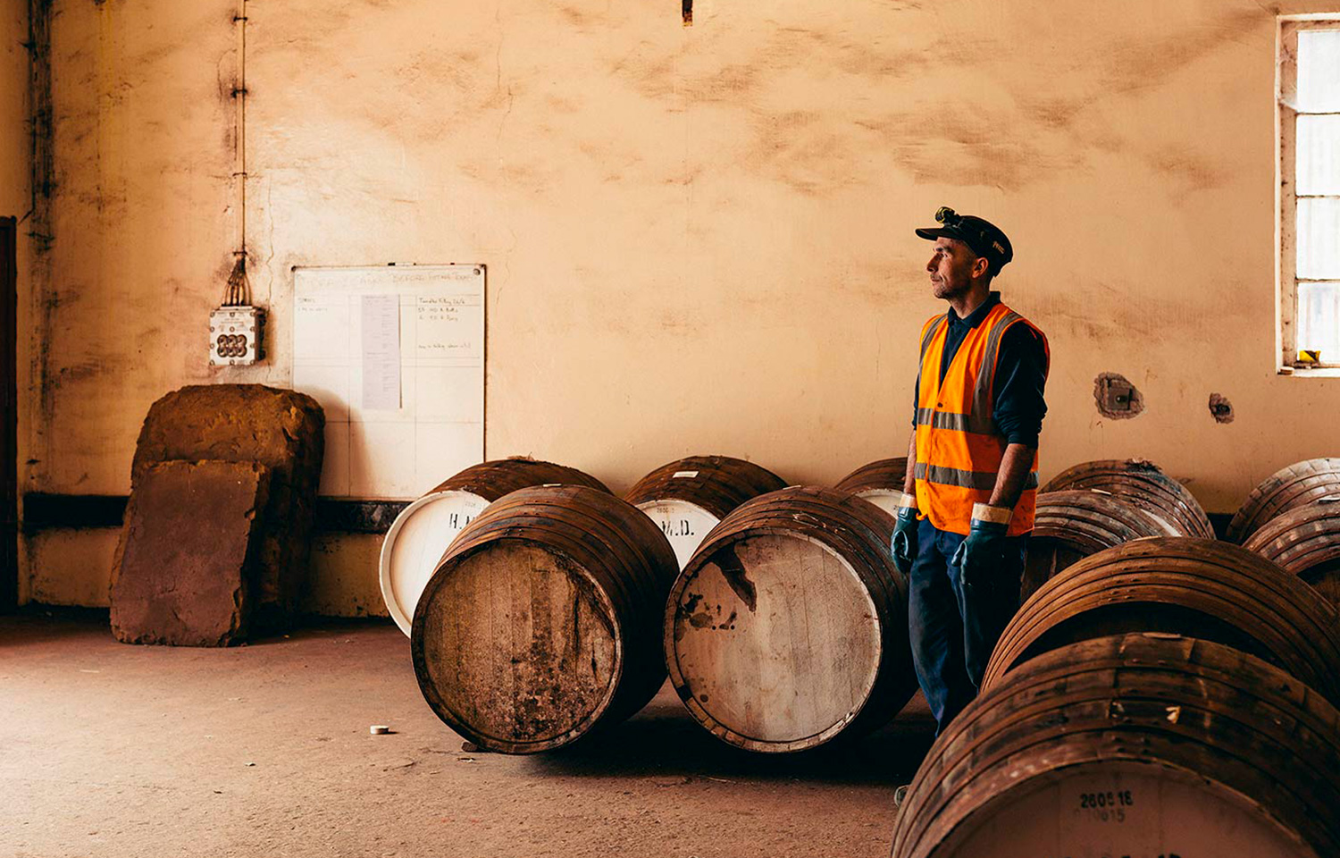
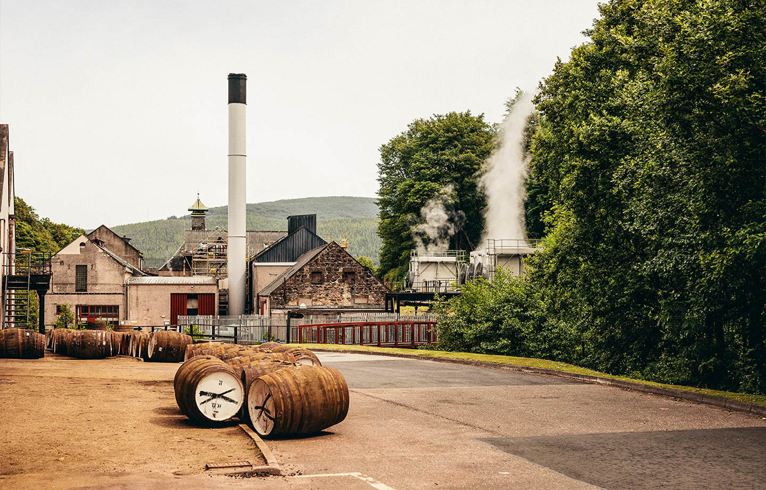
What lies beneath
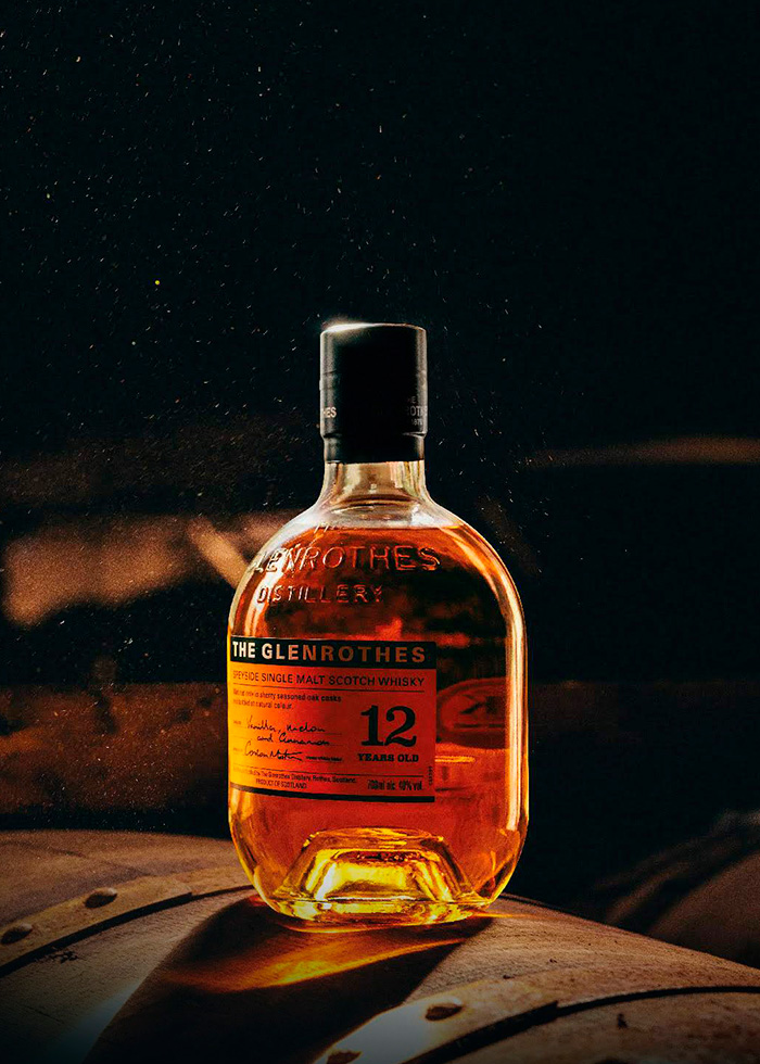
There’s no other distillery like The Glenrothes. Their story is that they do whisky. And they’re the most passionate.
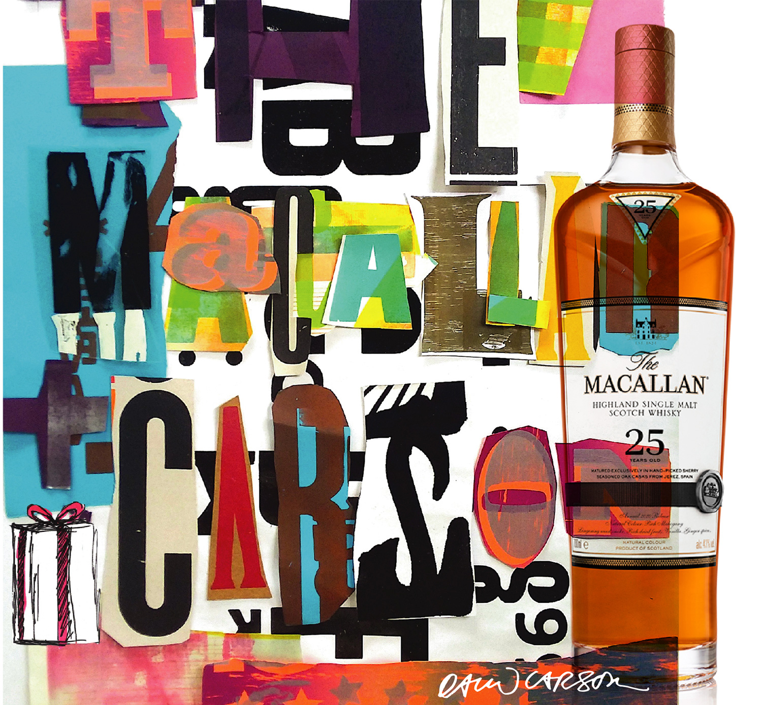
Colour is a key element. They change the packaging, NAS Disruption in the new outstanding cold palette

The process
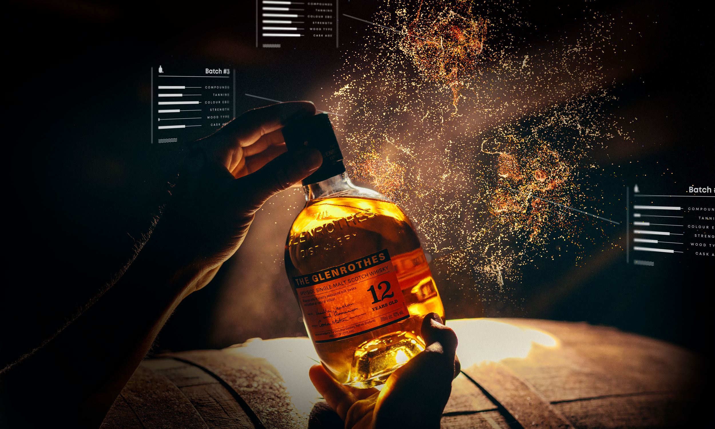
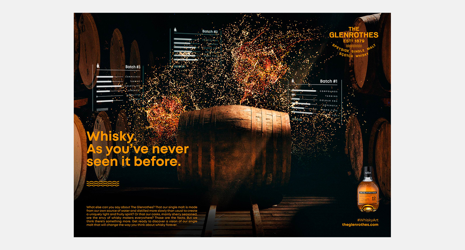
Together with data-artist Xavi Tribó, we developed an algorithm that brought all the secret data from The Glenrothes whisky to life. The result is this spectacular journey to the heart of the distillery and to the interior of a cask, in which this extraordinary whisky is presented like you’ve never seen before.
Graphic Campaign


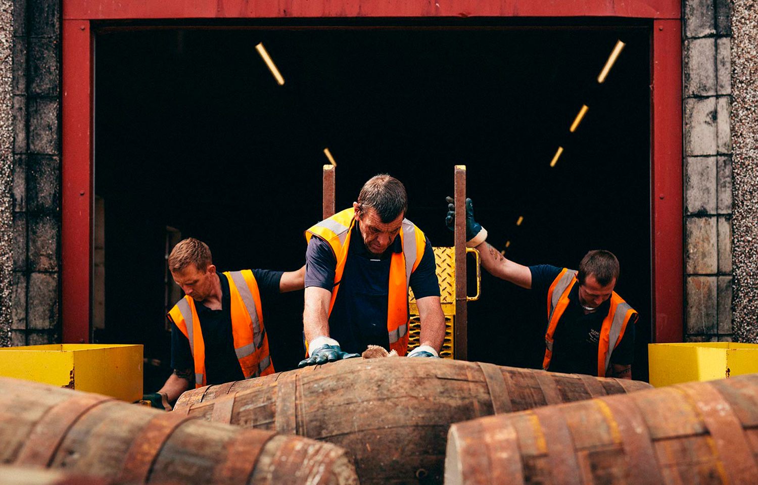
“We don’t do things because they’re quick or easy, we do them because they’re right”
Client
The Glenrothes
Project
What does authenticity look like?
Category
Branding, Packaging, Web Design
Year
2020
Photography
Yosigo
Art direction